The Pinterest DIY-Data Set: Visualizing How Learning Happens in DIY Communities of Practice on Pinterest


In a changing landscape of art education, educators are tasked with rethinking how teaching and learning happen within traditional academic contexts. Yet there is another kind of art education breaking the boundaries of traditional education found in DIY communities of practice, which convene on the social networking site, Pinterest. DIY communities on Pinterest function akin to Lave and Wegner’s concept of communities of practice, in which joint-enterprises are formed of by participants with various levels of expertise, who exhibit various degrees of participation. At present, the Do-It-Yourself (DIY) community is one of the largest creative content communities on Pinterest, yet little is known about interactions that lead to collective learning and knowledge production within these communities. To explore this topic, we generated visualizations of comment text data using the Pinterest-DIY Data Set, which consists of text data mined from 500 DIY project “Pins”. For this study, we visualized exchanges posted by users in the comments sections of nine DIY “Pins” with the highest number of reactions using word clouds. Re-presenting the rich textual content in this way provides a bird’s eye view of the exchanges taking place on the site, which can shed light on how users generally share information about DIY processes, learn, and generate knowledge about creative endeavors in joint enterprises. Studying collective learning and knowledge production happening in large populations of identifying and non-identifying Pinterest users in this way affords opportunities to examine collective artistic practice and art education not situated within traditional academic contexts. Moreover, studying DIY practices as opposed to fine art practices opens up possibilities for garnering insights on a broader range of creative endeavors, allowing teachers and learners opportunities to move beyond conventional modes of education.
A Witness to Art: Who Goes to the Museum?


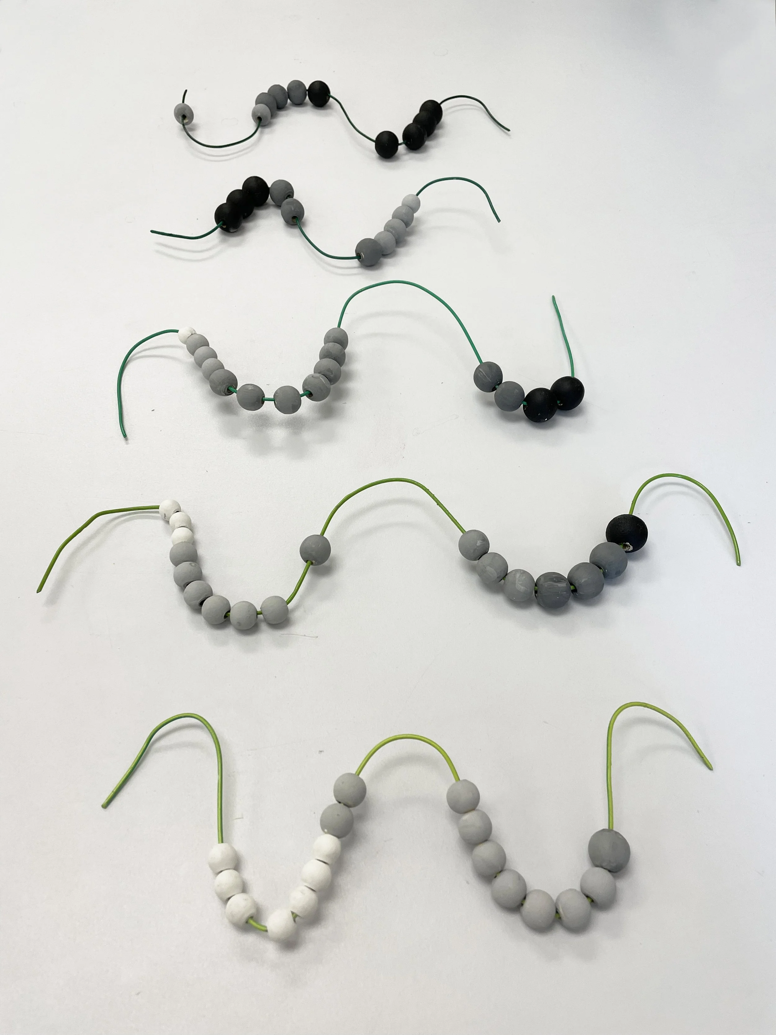
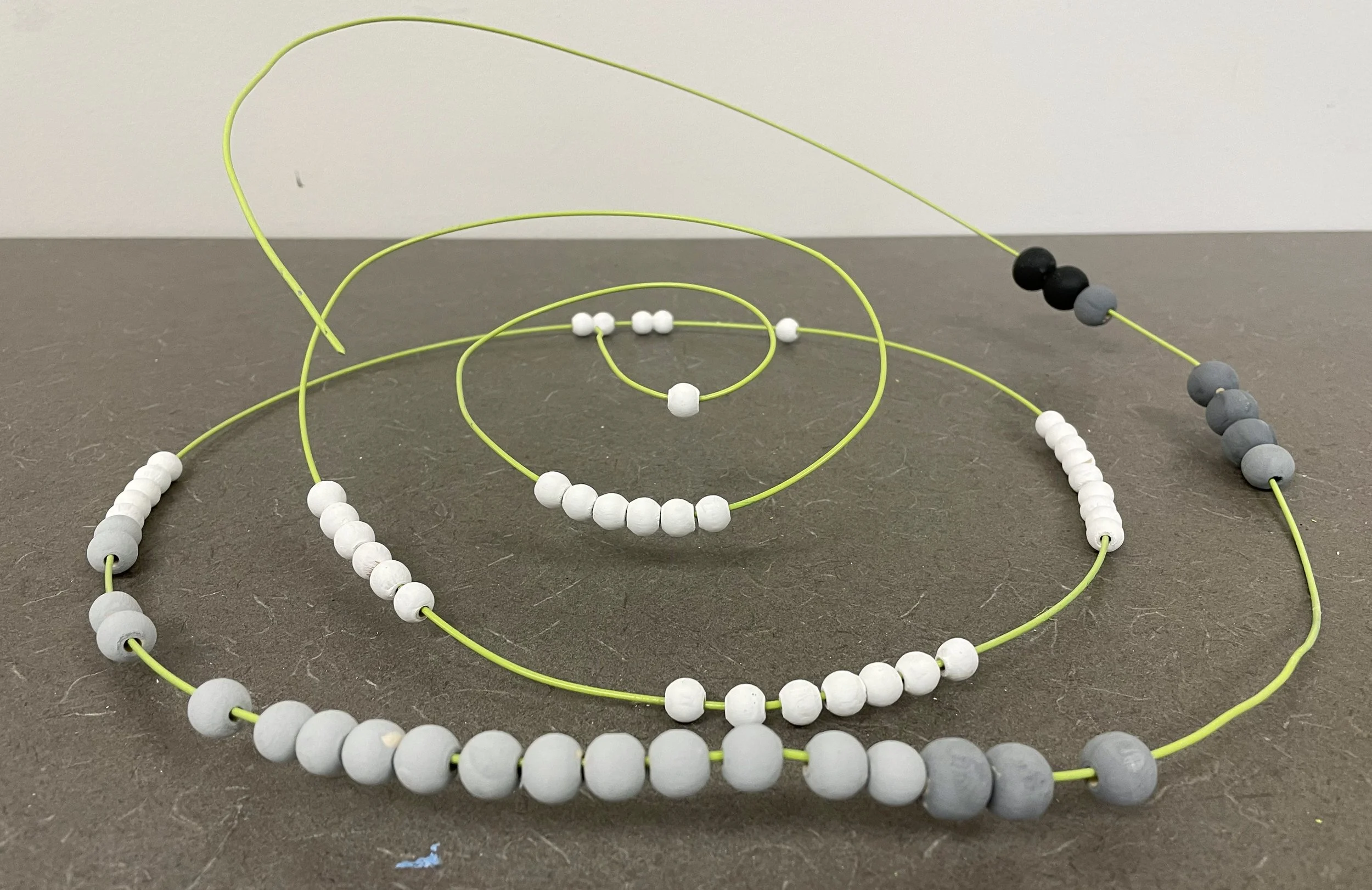
This art-based research provides a roadmap for meaningfully exploring museum demographic information using 3D data visualization. The project is a model designed to be implemented through a collaborative partnership with regional museum education programs. Fundamentally, the project aims to shed light on access to art institutions in various communities and promotes the value of participatory data visualization in interpreting data. To collect the data, a two-question survey is to be displayed as wall text in museum education centers asks: “What is your age?” and “What is your income bracket?” Craft beads featuring five monochromatic shades (ranging from white, to light gray, to medium gray, to dark gray, to black) represent five age group categories from 0 to 100+ years of age. These beads are located in five separate bowls for museum visitors to access. Museum visitors will choose the shade of their bead based on their age, and place that bead in the translucent green plexiglass vessel that represents their income bracket, ranging from $0 – $100K+ (from most to least translucent). As the beads accumulate in the vessels, this participatory artwork generates a material data set. Using the tubes as vitrines, this method results in the material manifestation of participants’ data, which visually resembles a traditional bar graph visualization. As the beads are collected over time (we recommend between 1-3 months based on preliminary studies), the data set is expanded. When enough data is collected (this will be determined by museum staff relative to their community’s influx of visitors), the museum will hold a workshop in which visitors are invited to “translate” the data by stringing the beads on an abacus. By first collecting the data in the plexiglass tubes, and then spatially re-arranging the structure of the data set, this process creates an opportunity to have a relatively dynamic experience with data. By combining relational aesthetics and participatory art-based research (ABR), viewers are not only essential to building the data set but are also invited to experience the data as it is accumulated and jumbled and subsequently clarified using the abacus format. This transmutation of data invites close looking at the relationship between age and income bracket, shedding light on who goes to the museum by zeroing in on two key factors that affect ability and access.

Violence Against Women Art Map
In 2021, twenty-four artists participated in a Penn State research study, analyzing artists’ responses to violence against women worldwide. This map reveals ten themes that emerged through 51 artist interviews, surveys, and focus groups, in addition to numerous artworks. Charting art activism, this map highlights how entanglements of culture, politics, history, and layers of identity influence how women experience violence.
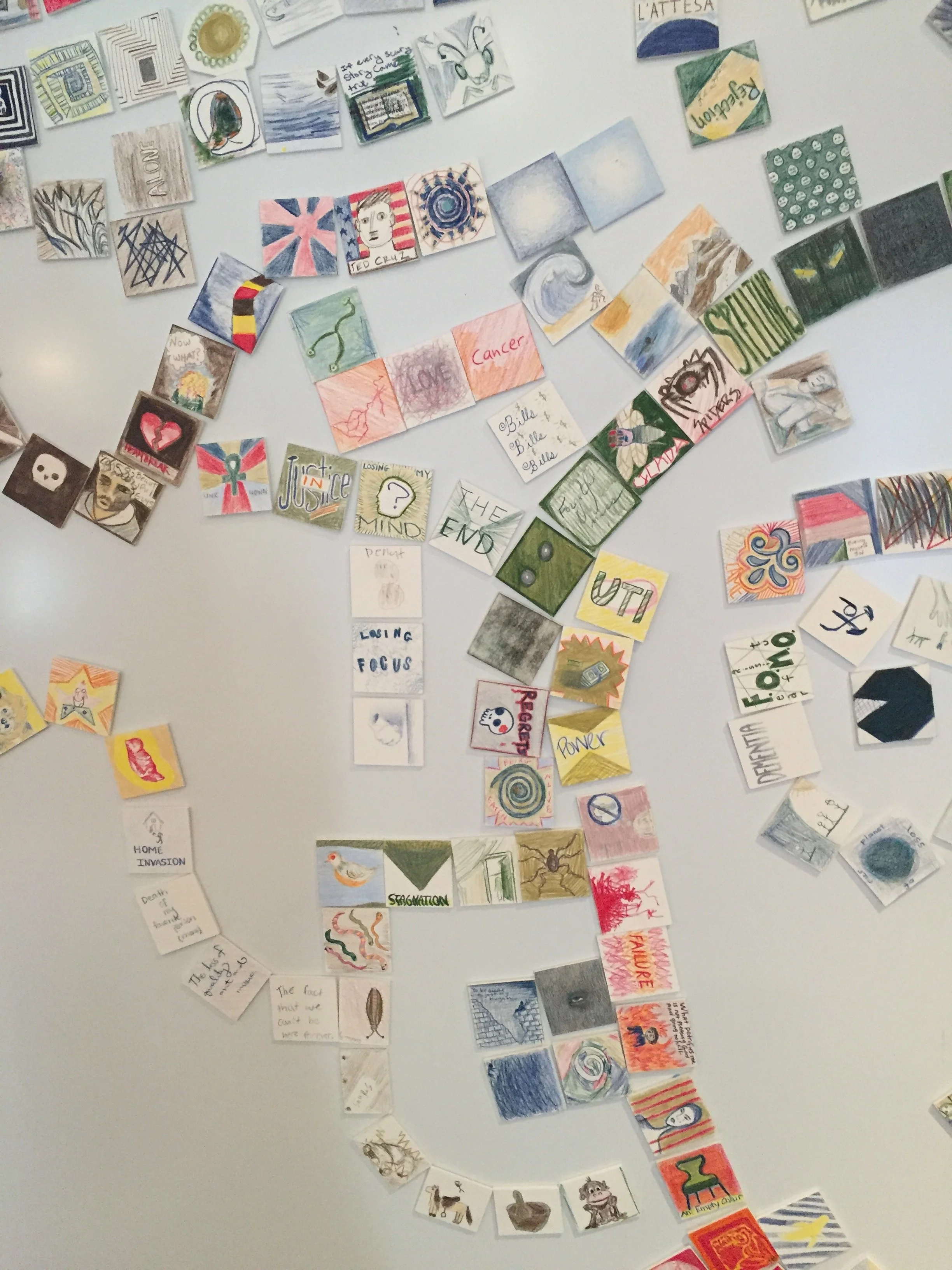
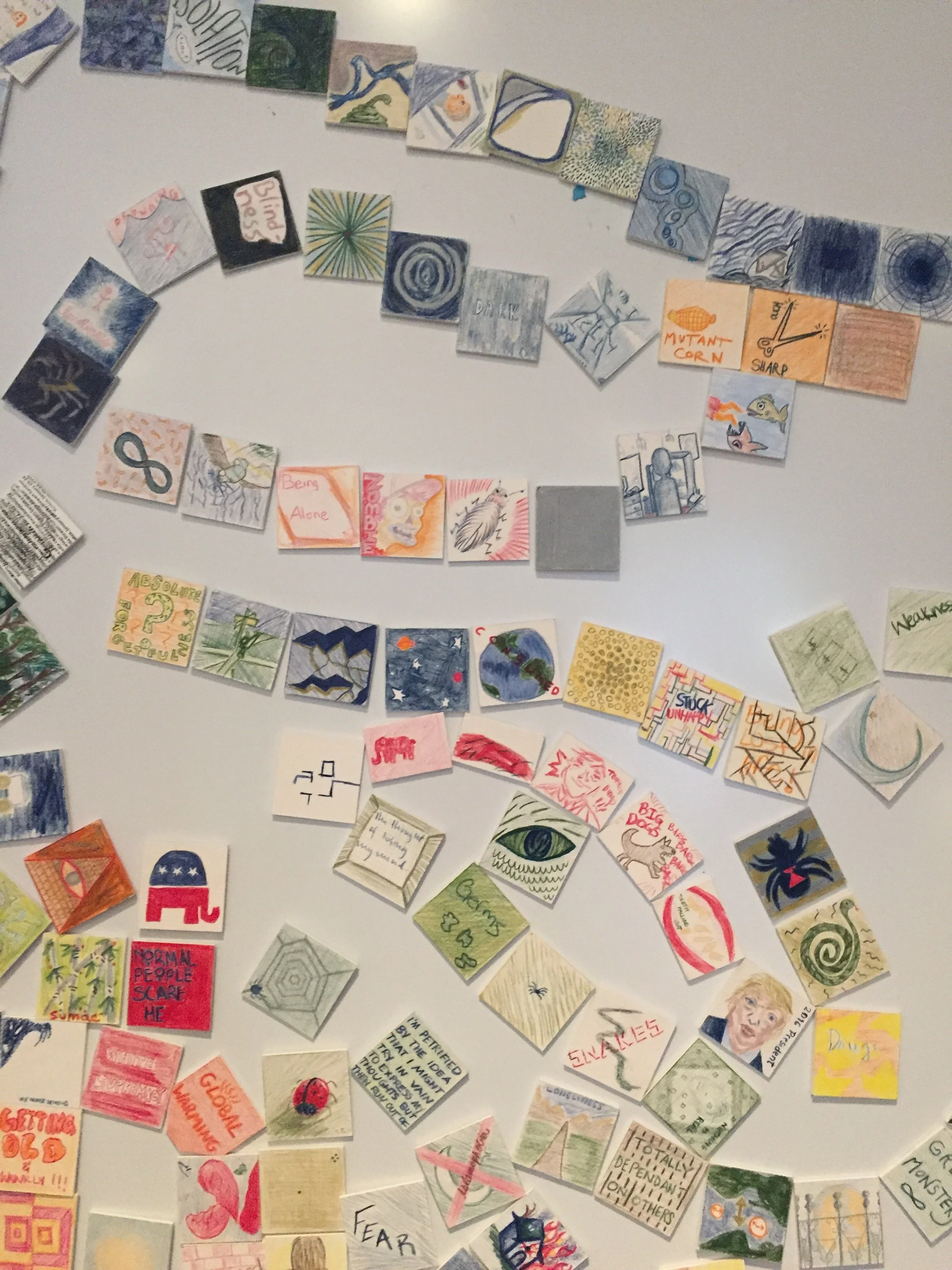
What Petrifies You?


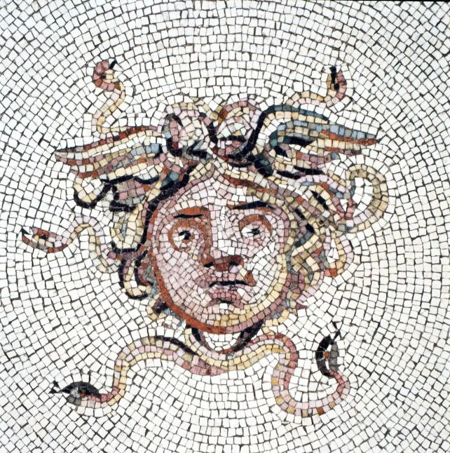
This workshop series invited museum goers to explore their own fears and anxieties through a series of creative activities. Over the course of two months, artist-in-residence Cesare Pietroiusti worked with three students from the SMFA, Boston to engage museum goers in a participatory data visualization at the Isabella Stewart Gardner Museum. The project examined themes of fear and mythology through interactive sessions in the museum education center. Conceptually, the project was inspired by the museum’s Greek bathhouse floor that depicts the head of Medusa, who famously petrified her victims—literally turning them to stone. With this in mind, as a participatory, socially engaged artwork, the project asked museum goers to visualize their deepest fears by drawing/writing on small cards. The cards served as pieces of the larger mosaic created over the course of the artist residency.